My Comic Font Adventure
I haven’t touched a traditional word processor in quite awhile. I don’t really have a problem with Microsoft Office (other than it not working on Linux) or LibreOffice or OnlyOffice, but like most geeky people, eventually I always end up going back to my mainstay for the last decade: using Pandoc to convert Markdown into LaTeX to get a PDF.
There’s a number of reasons for this. First, I think rendered LaTeX almost always ends up looking prettier, while also still looking professional. For sort of intangible but still perceptible reasons, the word spacing looks better, the fonts look a bit smoother, and it just comes together in a nicer product.
There’s also BibTeX. Once you get used to using BibTeX for your citations, it’s kind of hard to go back to virtually any other citation system. You don’t have to worry about formatting, or the ordering, or duplicates, or anything else. This works well with vanilla LaTeX, but also very well with recent versions of Pandoc with Markdown.
But the main reason? I simply like using plain text to do my work. Plain text is pure, there’s no hidden fonts or weird characters, the letter b is always the letter b, not “the letter b with the italic modifier and the Times New Roman font and size 12”. I’m a geeky dude, I knowing exactly what’s in my document.
Being plain text also lets me use whatever editor I’d like, which is NeoVim, and because of that, I can write any document in any font (and any font size) that I would like and then render it in a fancy font later. Perhaps because of this freedom, I’ve grown fairly strong opinions about fonts. I stare at plain text all day, nearly every day, so I want something pleasant to look at and easy to read.
I find nothing much easier to read than the more “playful” fonts. Say what you want about Comic Sans, but I stand by it being one of the most pleasant fonts if you need to spend the entire day reading and writing text all day. It’s playful, but the letters are clearly defined and unambiguous, and I think that the curvy style is just nice to look at. This isn’t just my opinion, there is a movement to utilize Comic Sans to allow for a more dyslexic-friendly workspace, so this stuff does really matter.
Recently, I was curious to the current state-of-the-art of comic-style coding fonts, so I decided to work my way through them and wanted to give my opinion.
Comic Mono
For the last five years, I have almost exclusively used the Comic Mono font. It is a direct modification of the original Comic Sans MS font so that the characters are all the same size, making it more suitable for code editors.
I initially installed it as a joke for a screenshot to send to a friend, but I stuck with it because I have ended up really liking it. It’s quite clean, free, and easy to read for long periods of time. It doesn’t have any fancy ligatures or anything, but I don’t really care about those, and it does the job pretty well. There’s a reason I have installed it on multiple computers over the last half-decade.
I think it goes without saying that I recommend trying it out to see if you like it. It’s free, and I think it’s great.
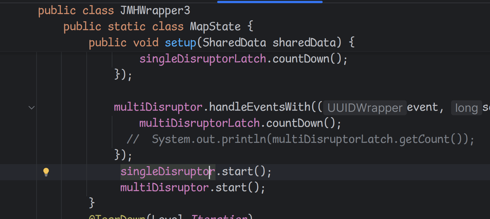
As of the writing of this article, I am using Comic Mono as the font for this blog, so you should already know if you like it, though here’s a screenshot in case I change it:
Serious Shanns
Serious Shanns is modification of Comic Mono (a mod of a mod!).
It advertises the following differences:
Edits the ‘a’ to make it look less like an ‘o’ Edits the ’l’ to make it look less like a ‘1’ Edits the ‘Y’ to make it look less like a ‘y’ Adds ‘λ’, ‘ł’, and ‘Ł’ glyphs Adds a Light weight style Adds Italic styles for each weight style
I don’t really care about the fancy glyphs, but I do see the appeal of making the l look more explicitly different than 1, as that might be useful for people with reading disabilities like dyslexia.
I used this font for a few hours to try it out, and while I didn’t dislike it, I simply felt that the new characters looked “wrong” next to the normal Comic Sans characters. I tried, but I was never able to get used to it, and it never stopped bothering me.
Honestly, the new characters don’t look “bad” or anything. I think if I had been using Serious Shanns for the last five years, I’d likely prefer it, but as it stands I don’t think I’m going to use it.
That said, it’s free, and if you suffer from dyslexia, it’s certainly worth checking out.
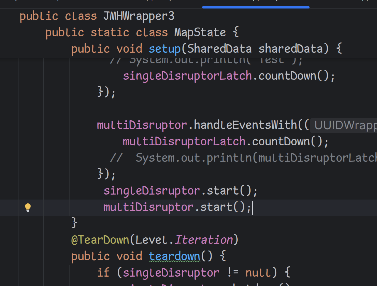
Here’s a screenshot of the same code:
Comic Code
Comic Code is completely new font, released about four years ago. It cost $12 for an individual font, or $30 for the entire pack, but they do have a demo you can get for free. The demo is “ok enough” to try it out, but it’s missing some obvious symbols, like parentheses, so you really can’t code a lot with it.
I tried this one for about an hour. I can’t really explain why, but I didn’t like it. It looks nice enough, but it looks too…Pointy? It doesn’t quite look “bubbly” enough for me.
I think I also simply wasn’t able to get over the fact that it cost me $12. It’s possible that I would have preferred the bolder versions, but that would cost another $12, and I wasn’t willing to fork over that much for something that I wasn’t sure I’d like, especially when other comic fonts are free.
I will admit that the ligatures are kind of cool. I used to be pretty against them, but there’s something pretty satisfying about seeing something like -> turn into an arrow symbol, and the arrow still retains the same comic style, but they don’t make up for the fact that I simply didn’t enjoy using the font. I don’t think the font is poorly made or ugly. Quite the contrary, it’s a very nice font that just didn’t click with me.
I’m definitely in the minority, I think most people really like it, but to me I think it’s a bit overpriced. I’d definitely recommend you try playing around with the demo version to see if it’s something you’d like before spending any money.
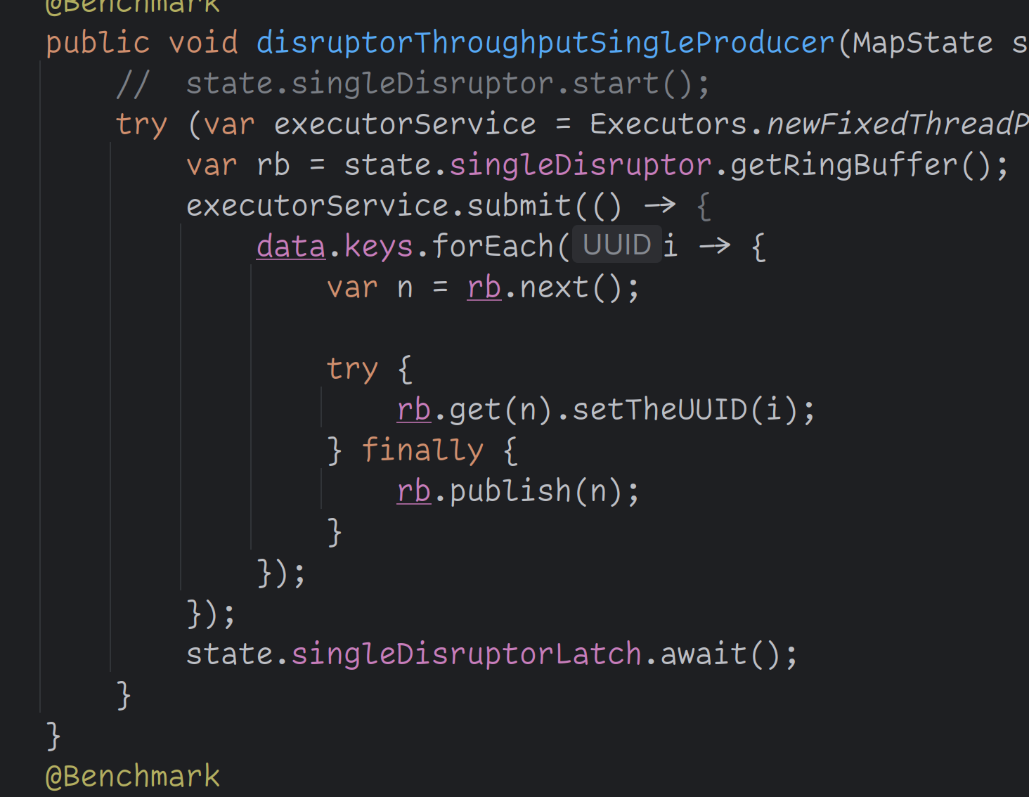
Here’s a screenshot of a slightly different area of code to show off the ligatures:
Recursive Mono Casual Regular
The Recursive fonts are a suite of extremely customizable fonts, available for free.
I opted for the casual font, since it felt the most analogous to Comic Sans, and my review is short: I really like it.
It looks similar enough to Comic Sans to have the same playful and easy-to-read style, but is also unique enough so that the “fixes” don’t clash like Serious Shanns did. Like Serious Shanns, the l and 1 are unambiguous, but since it’s a new font it looks more natural to me, or at least it doesn’t bother me. It also has ligatures similar to Comic Code, so you get the best of everything.
I’ve been writing this entire post with it, and I think it might be even more pleasant to look at Comic Mono. I think I’m going to stick with this one for a few more days, but it might be my new go-to font.
I definitely recommend checking it out. Again, it’s free, so you’re not risking a lot doing so.
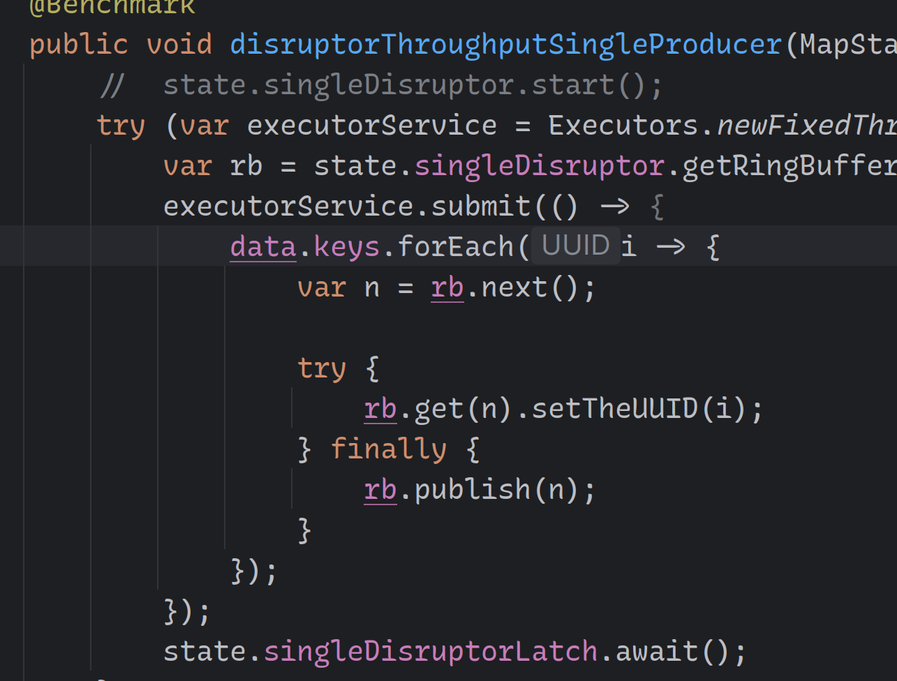
Screenshot:
Conclusion
It was fun to try out different fonts, just to see what’s out there. Do I think that a new font will make you a better programmer or more productive? No, I don’t think that’s the case, but it’s something software engineers have to look at for long periods of time, so I don’t think it’s weird to try and find something you like.
If you have any recommendations for fun fonts, please let me know, I’m always interested in playing with these things.